[1] "Hello world!"Introduction to ggplot2
Why visualize data?
Why visualize data?
Data visualization is not a decoration; it is an analytical instrument.
Human cognition is optimized for pattern recognition in visual space, not for reading tables or numbers.
Well Done!

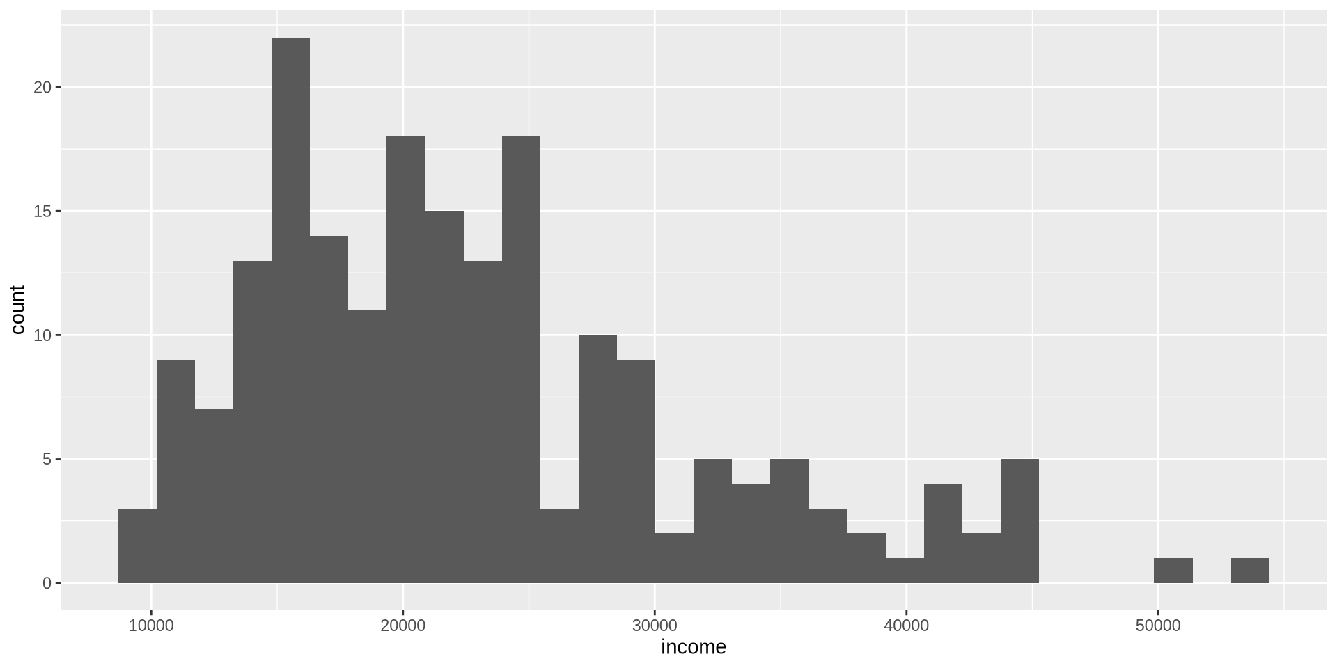
How is income distributed?
Distribution of one continuous variable
Histogram
Take my data set named earnings,
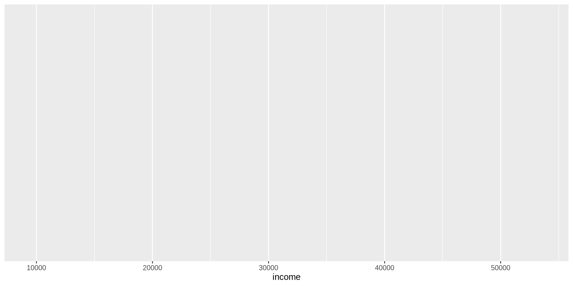
I want to make a visualization, take my data set and apply ggplot.
What we will have is a blank piece of paper. We did not specified our axises yet.

How is income distributed?
Distribution of one continuous variable
Histogram
Similar to drawing with hand, we first draw the x and y axis. To do this with R we use the function aes(x ={ variable name}). And we add this into our existing blank page using + symbol.
+ will always be at the end of the lines.
For histograms, we only need to give the name of the x variable, R will count each observations by itself!
How is income distributed?
Distribution of one continuous variable
Histogram
How is income distributed?
Distribution of one continuous variable
Histogram
How is income distributed?
Distribution of one continuous variable
Histogram
First fix this awful plot with start by adding a theme on top of our visualization. theme_{theme name} allows us to use a theme. Make sure theme is always at the last line.
How is income distributed?
Distribution of one continuous variable
Histogram
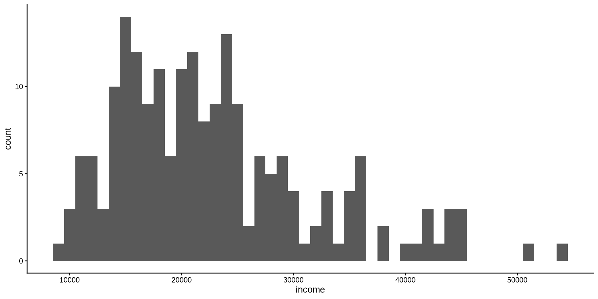
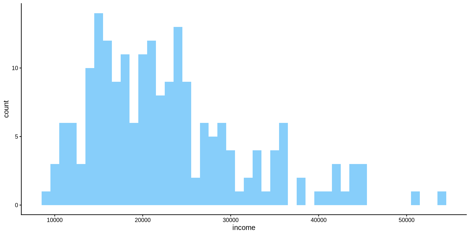
By default R chooses some binwidth by itself inside geom_histogram(), even though we don’t see it geom_histogram(binwidth = 30). We want to change binwidth to what we want: binwidth=1000
How is income distributed?
Distribution of one continuous variable
Histogram
R also chooses which color to fill the bins with. We want to change the color of the filling to lightskyblue inside geom_histogram(binwidth = 1000, fill={"name of the color"}).
Note that we use , to separate each argument.
How is income distributed?
Distribution of one continuous variable
Histogram
To change the color of the edges of the bins we use color={name of the color} argument inside geom_histogram(). Lets change it to black.

How is income distributed?
Distribution of one continuous variable
Histogram
How is income distributed?
Distribution of one continuous variable
Histogram
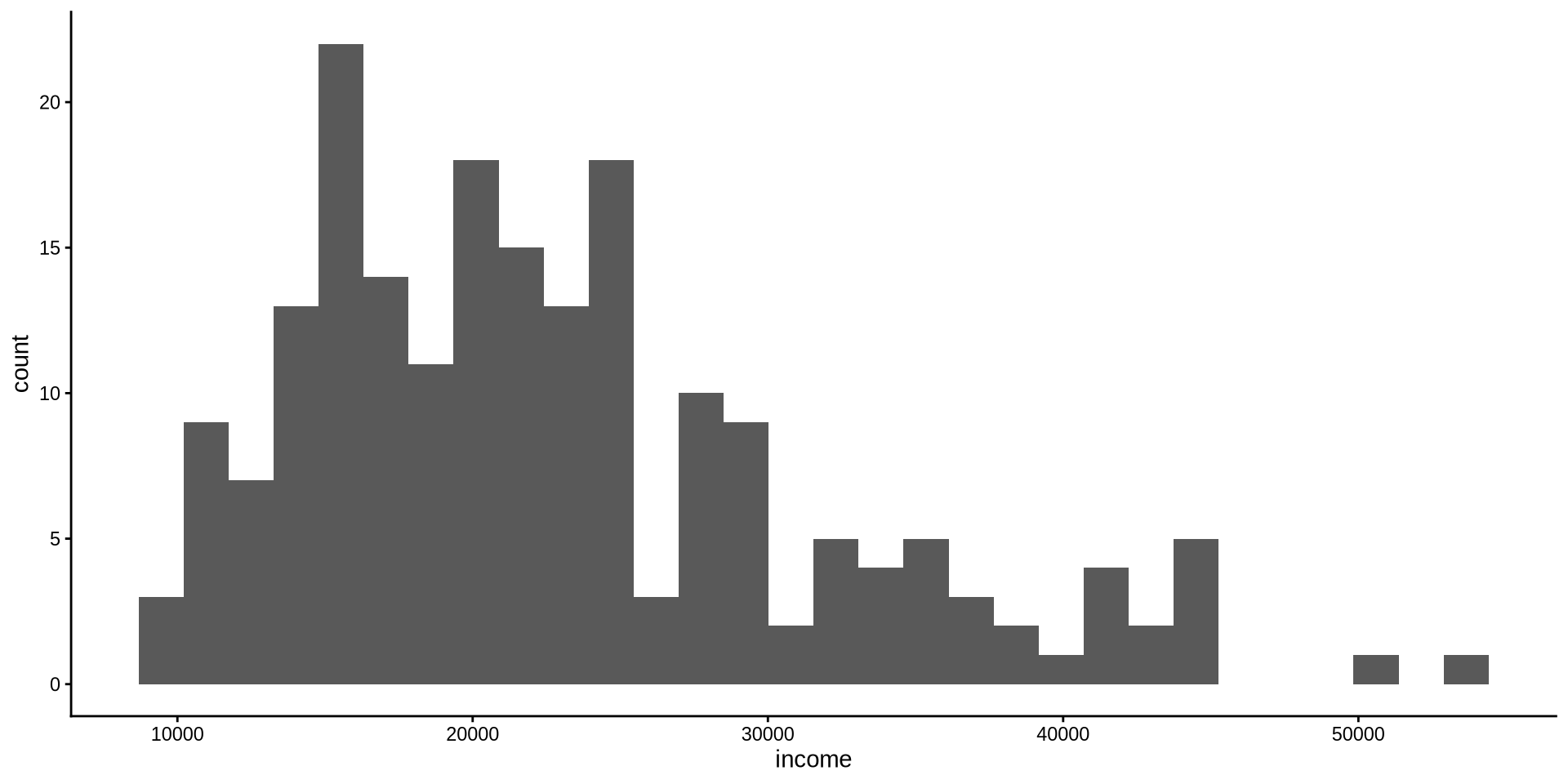
We have the same problem in y axis as well.
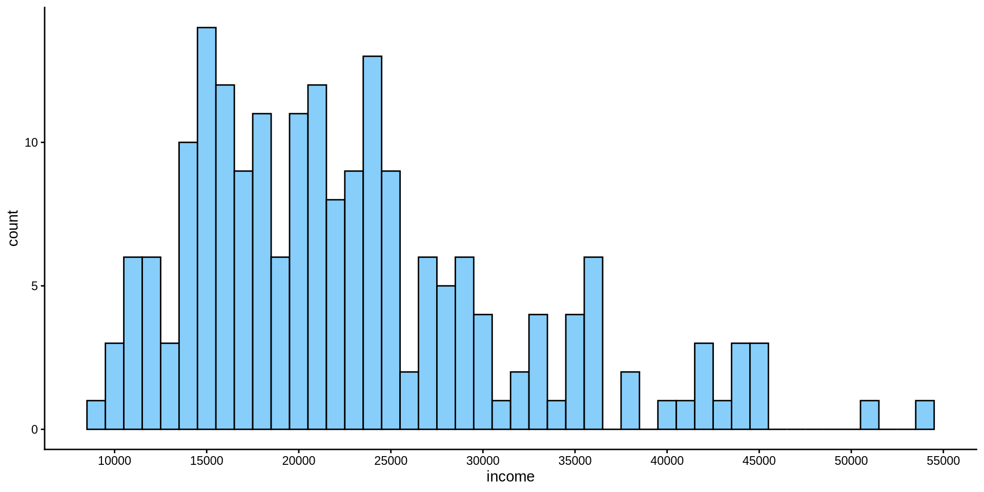
How can we increase the number of values in y axis? For x axis the function was scale_x_continuous(n.breaks=10). Can you set the number of breaks on y axis to 10?
scale_y_continuous(n.breaks =10)
How is income distributed?
Distribution of one continuous variable
Histogram

How is income distributed?
Distribution of one continuous variable
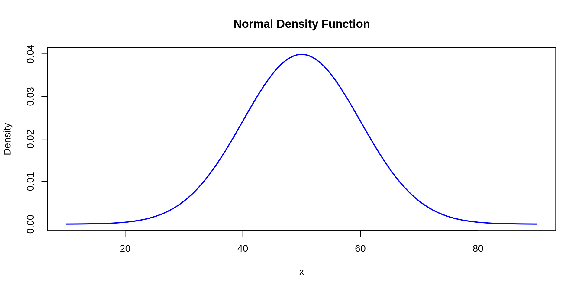
Density Plot
- \[ f(x) = \frac{1}{\sigma \sqrt{2\pi}} \exp\left(-\frac{(x-\mu)^2}{2\sigma^2}\right) \]
How is income distributed?
Distribution of one continuous variable
Density Plot
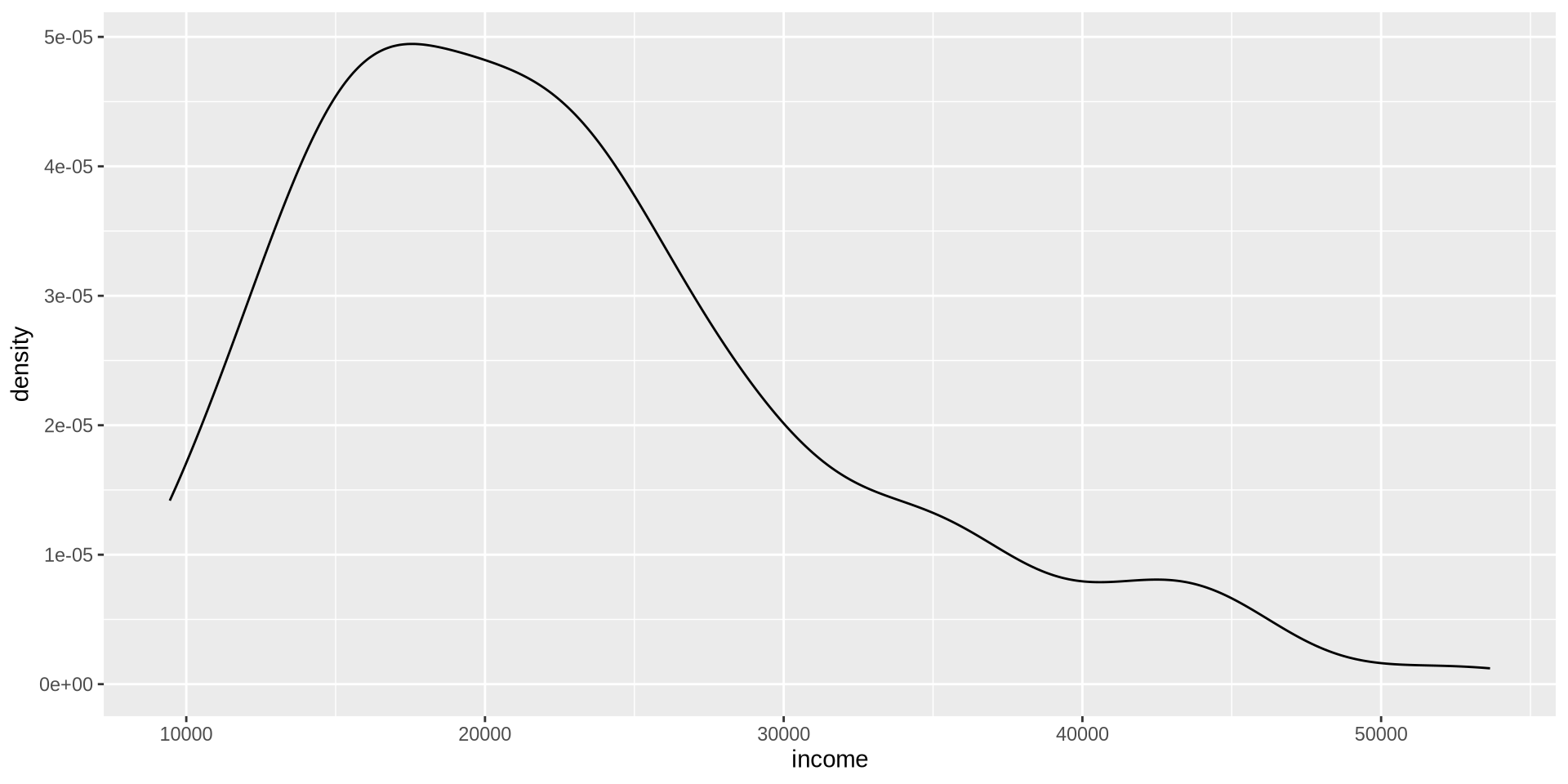
How is income distributed?
Distribution of one continuous variable
Density Plot
How is income distributed?
Distribution of one continuous variable
Density Plot
Now we add a theme of your choice by starting to type theme_ on the right side of the suggestions you will see ggthemes, choose one from there.
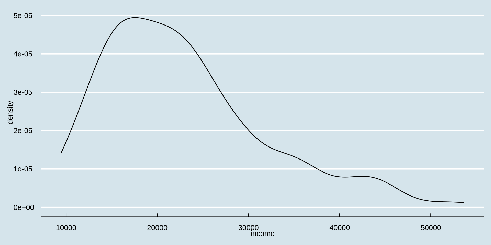
How is income distributed?
Distribution of one continuous variable
Density Plot
I don’t like the black color of the density line. Lets change it to “azure4” using the color argument inside geom_density(color = {"color you prefer"})
How is income distributed?
Distribution of one continuous variable
Density Plot
The width of the line seems a bit thin, can we increase it with linewidth argument inside geom_density(). By default it is set to geom_density(linewidth = 1).
geom_density(color = {"color you prefer"}, linewidth = {width number you prefer})
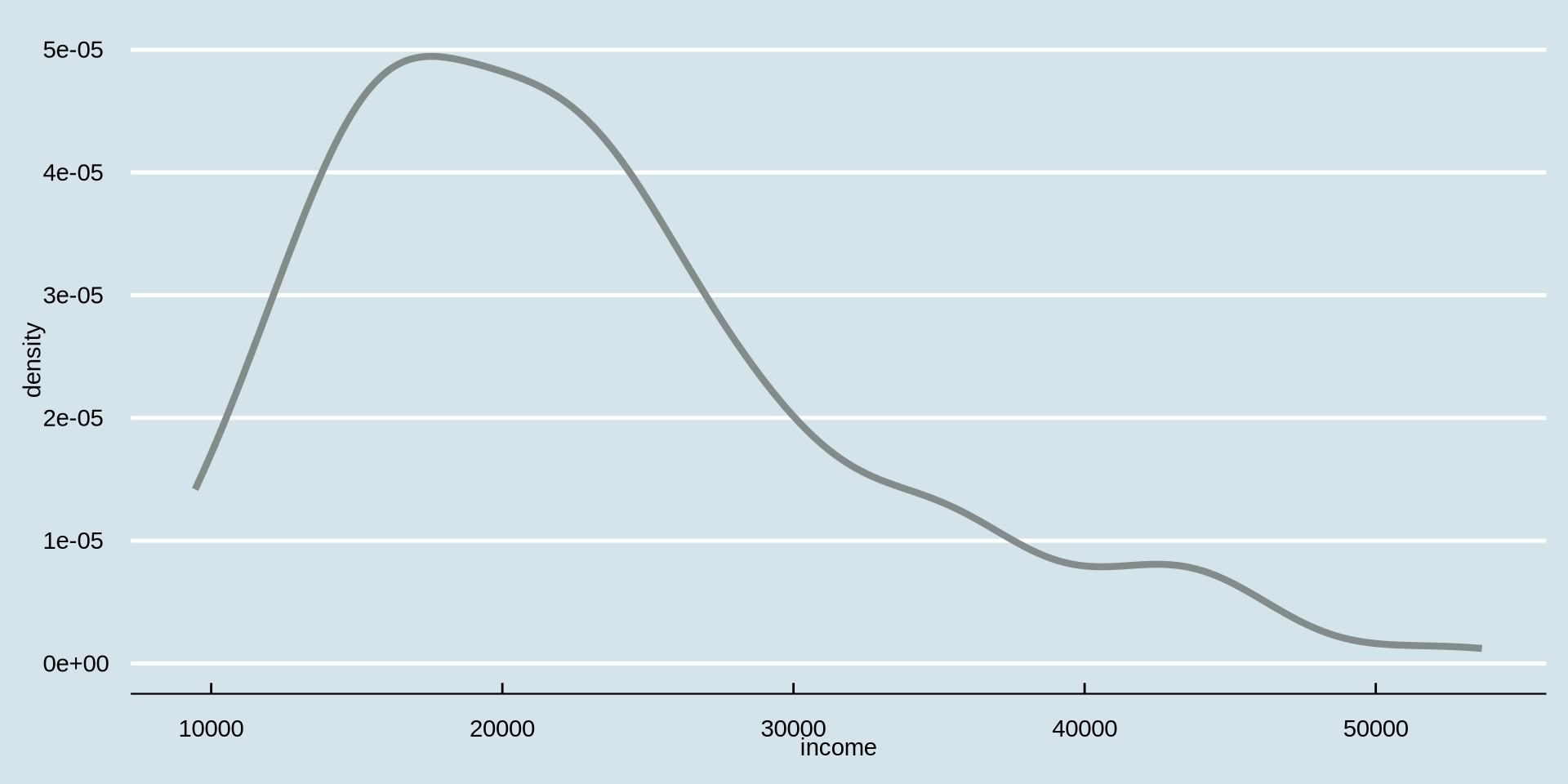
How is income distributed?
Distribution of one continuous variable
Density Plot
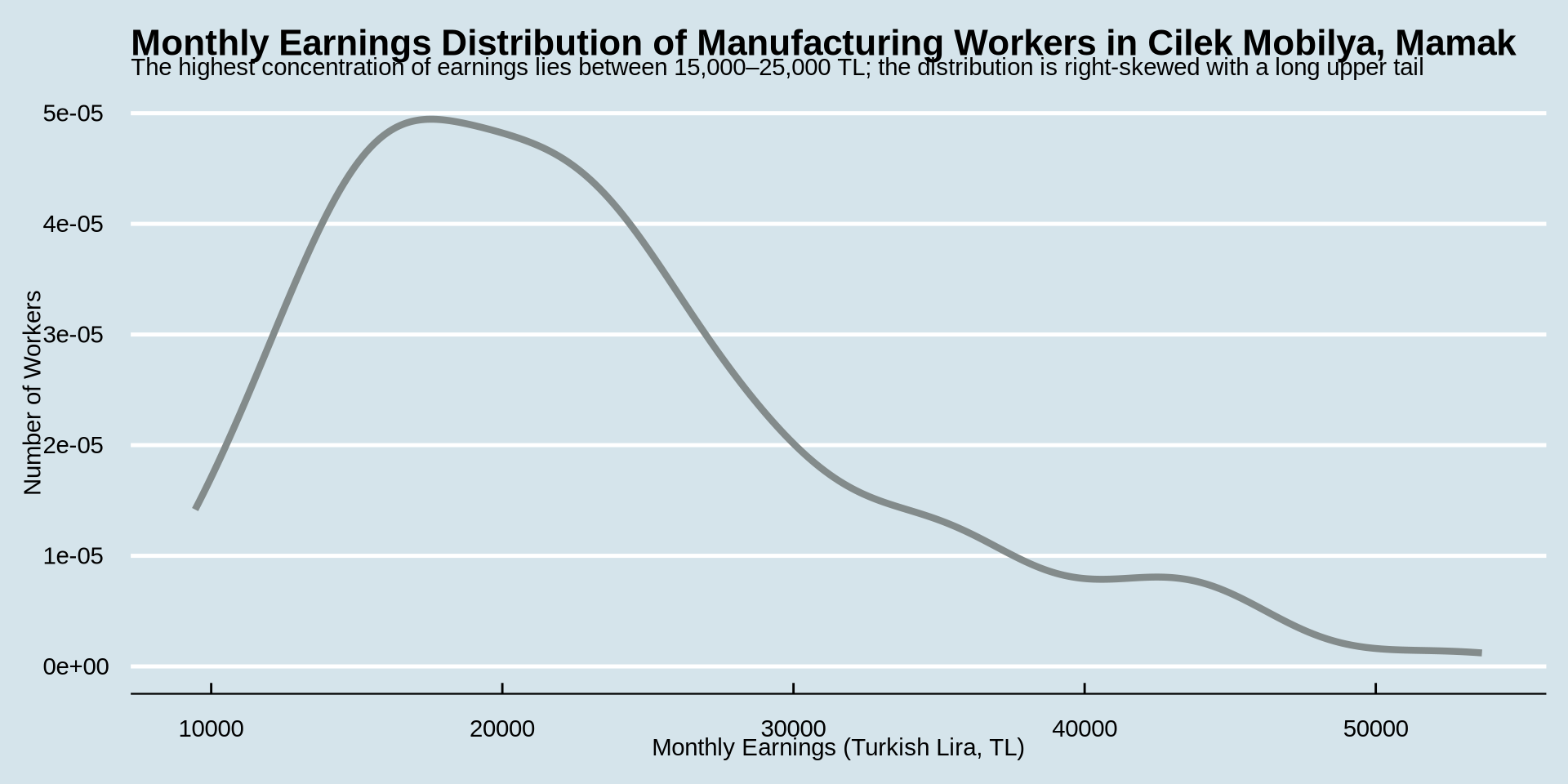
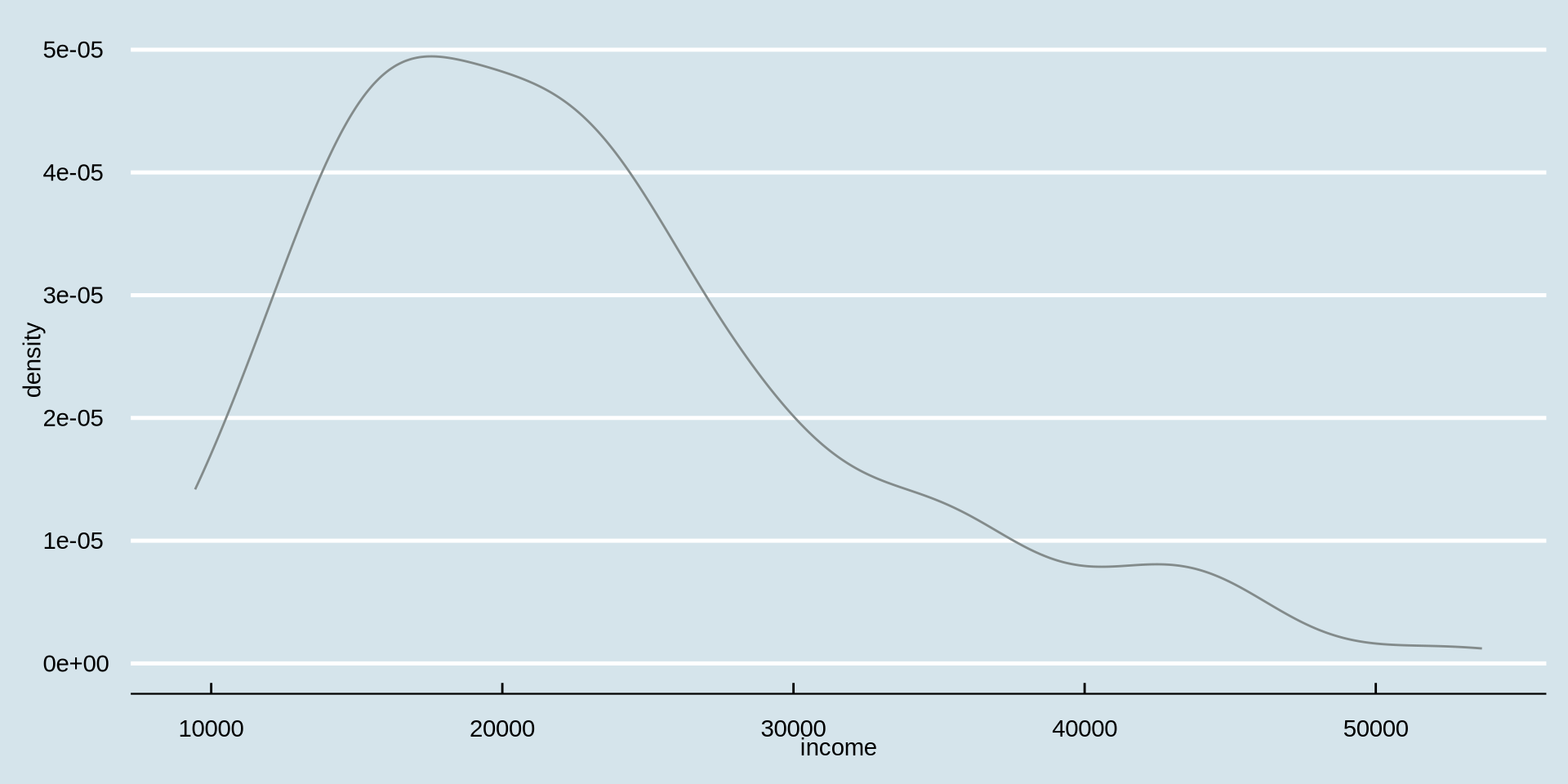
How is income distributed between genders?
Distribution of one continuous variable over a group
Density Plot - change line color based on gender
This was our code and plot
earnings %>%
ggplot() +
aes(x = income) +
geom_density(color = "azure4", linewidth = 1.5) +
labs(
title = "Monthly Earnings Distribution of Manufacturing Workers in Cilek Mobilya, Mamak",
subtitle = "Most workers earn between 15,000–25,000 TL; distribution is right-skewed with a small number of high-income outliers",
x = "Monthly Earnings (Turkish Lira, TL)",
y = "Number of Workers"
) +
theme_economist()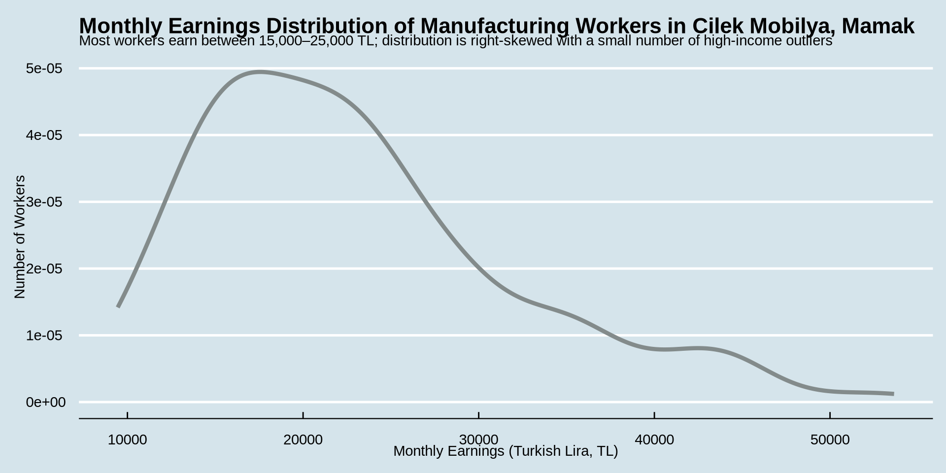
How is income distributed?
Distribution of one continuous variable over a group
Density Plot
earnings %>%
ggplot() +
aes(x = income, color = gender) +
geom_density(linewidth = 1.5) +
labs(
title = "Monthly Earnings Distribution of Manufacturing Workers in Cilek Mobilya, Mamak",
subtitle = "Most workers earn between 15,000–25,000 TL; distribution is right-skewed with a small number of high-income outliers",
x = "Monthly Earnings (Turkish Lira, TL)",
y = "Number of Workers"
) +
theme_economist()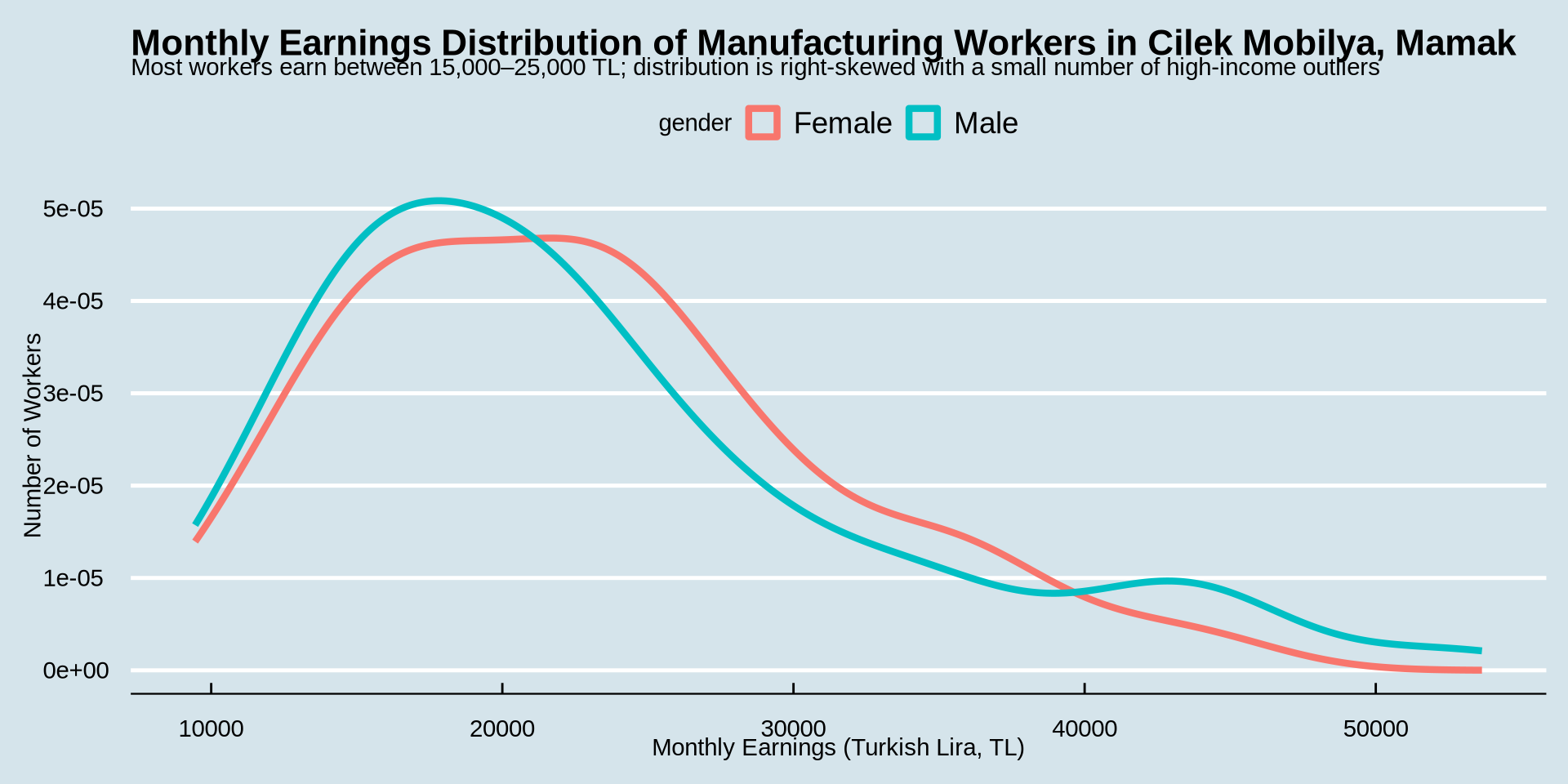
How is income distributed?
Distribution of one continuous variable over a group
Density Plot
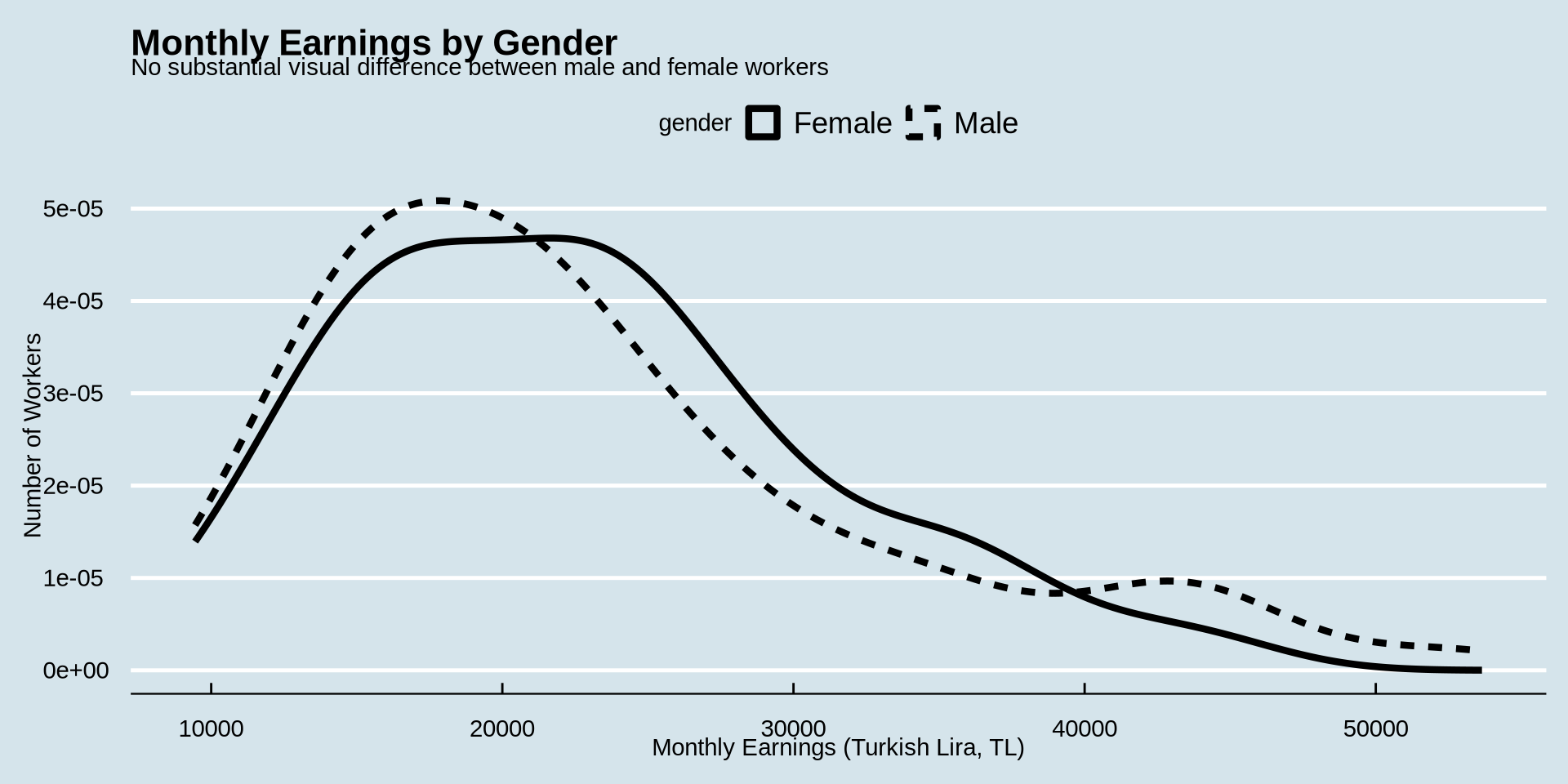
earnings %>%
ggplot() +
aes(x = income, color = gender) +
geom_density(linewidth = 1.5) +
labs(
title = "Monthly Earnings by Gender",
subtitle = "No substantial visual difference between male and female workers",
x = "Monthly Earnings (Turkish Lira, TL)",
y = "Number of Workers"
) +
theme_economist()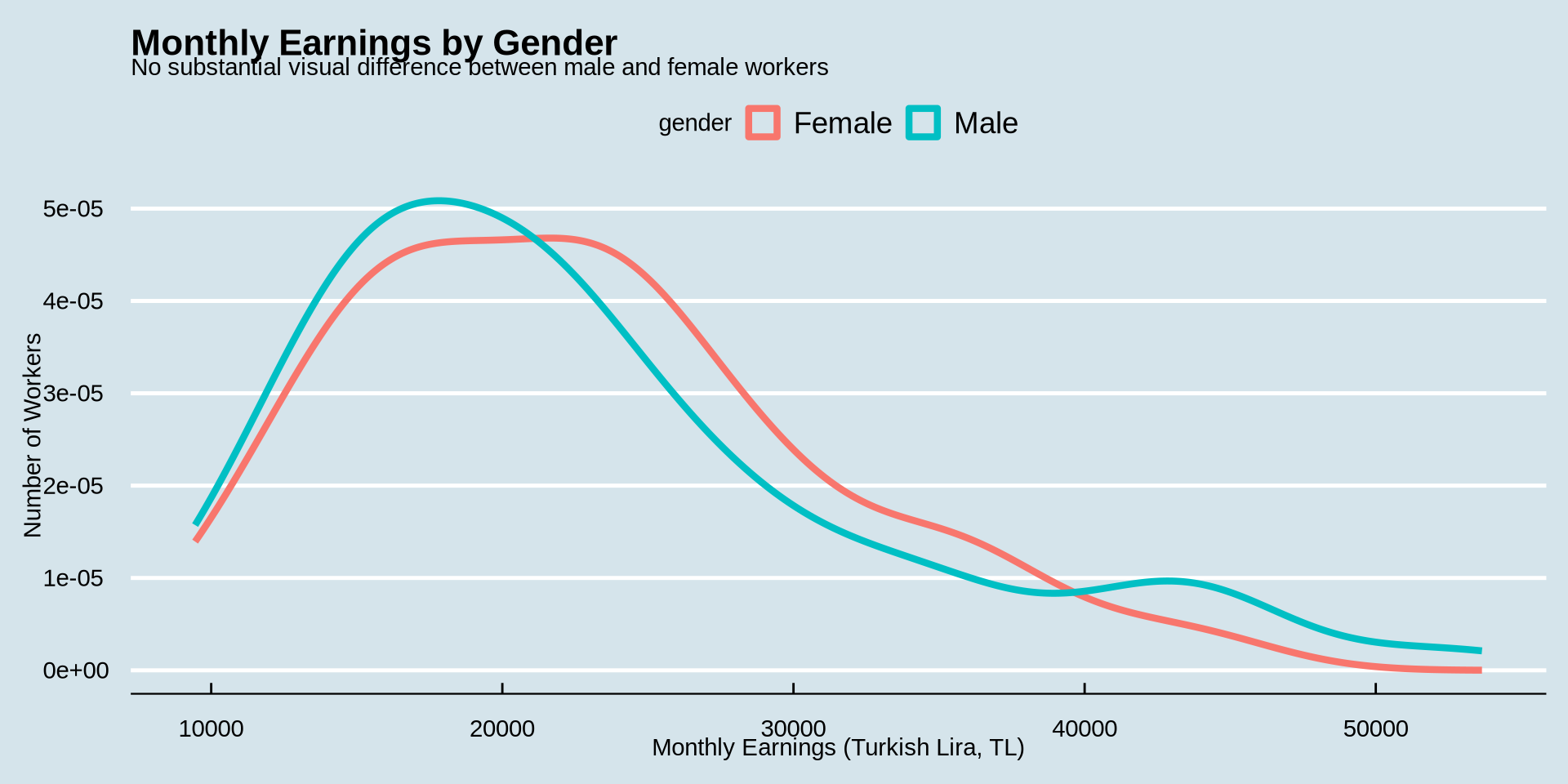
How is income distributed?
Distribution of one continuous variable over a group
Density Plot - change color type based on gender
How is income distributed?
Distribution of one continuous variable over a group
Histogram
Remember our histogram code?
earnings %>%
  ggplot() +
  aes(x = income) +
  geom_histogram(binwidth = 1000, fill = "lightskyblue", color = "black") +
  scale_x_continuous(n.breaks = 10) +
  scale_y_continuous(n.breaks = 10) +
    labs(
    title = "Monthly Earnings Distribution of Manufacturing Workers in Cilek Mobilya, Mamak",
    subtitle = "Most workers earn between 15,000–25,000 TL; distribution is right-skewed with a small number of high-income outliers",
    x = "Monthly Earnings (Turkish Lira, TL)",
    y = "Number of Workers"
  ) +
  theme_classic()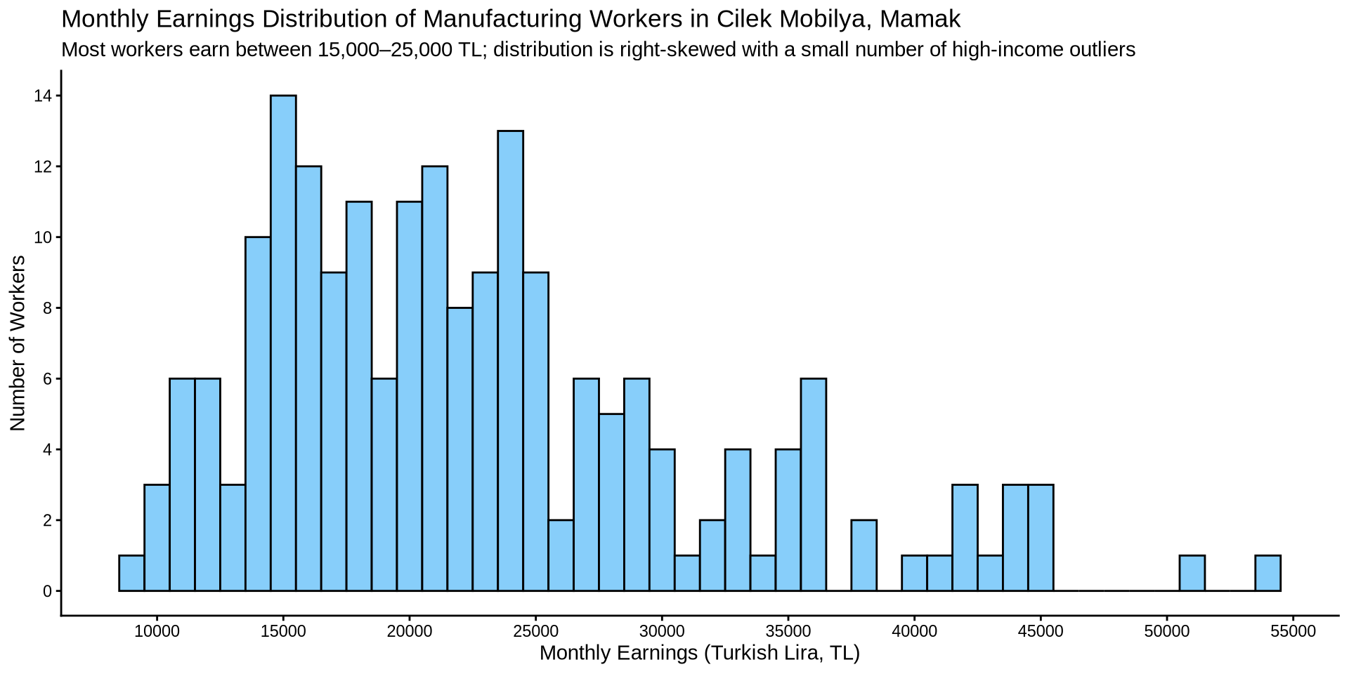
How is income distributed?
Distribution of one continuous variable over a group
Histogram
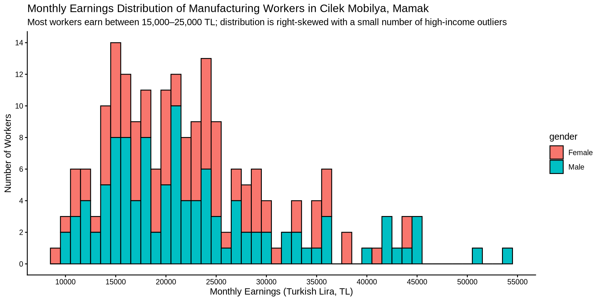
Instead of setting one color to fill the bins, lets fill the bins based on gender. While there, change the theme to a nicer one.
earnings %>%
  ggplot() +
  aes(x = income, fill = gender) +
  geom_histogram(binwidth = 1000, color = "black",) +
  scale_x_continuous(n.breaks = 10) +
  scale_y_continuous(n.breaks = 10) +
    labs(
    title = "Monthly Earnings Distribution of Manufacturing Workers in Cilek Mobilya, Mamak",
    subtitle = "Most workers earn between 15,000–25,000 TL; distribution is right-skewed with a small number of high-income outliers",
    x = "Monthly Earnings (Turkish Lira, TL)",
    y = "Number of Workers"
  ) +
  theme_classic()