- 1
- Use the tidyverse, janitor, and ggthemes libraries
- 2
- Read the CSV file and then do the following ( %>% )
- 3
-
Show it as a
tibbleand save it ashate_crimes
Scatter Plots & Relationships
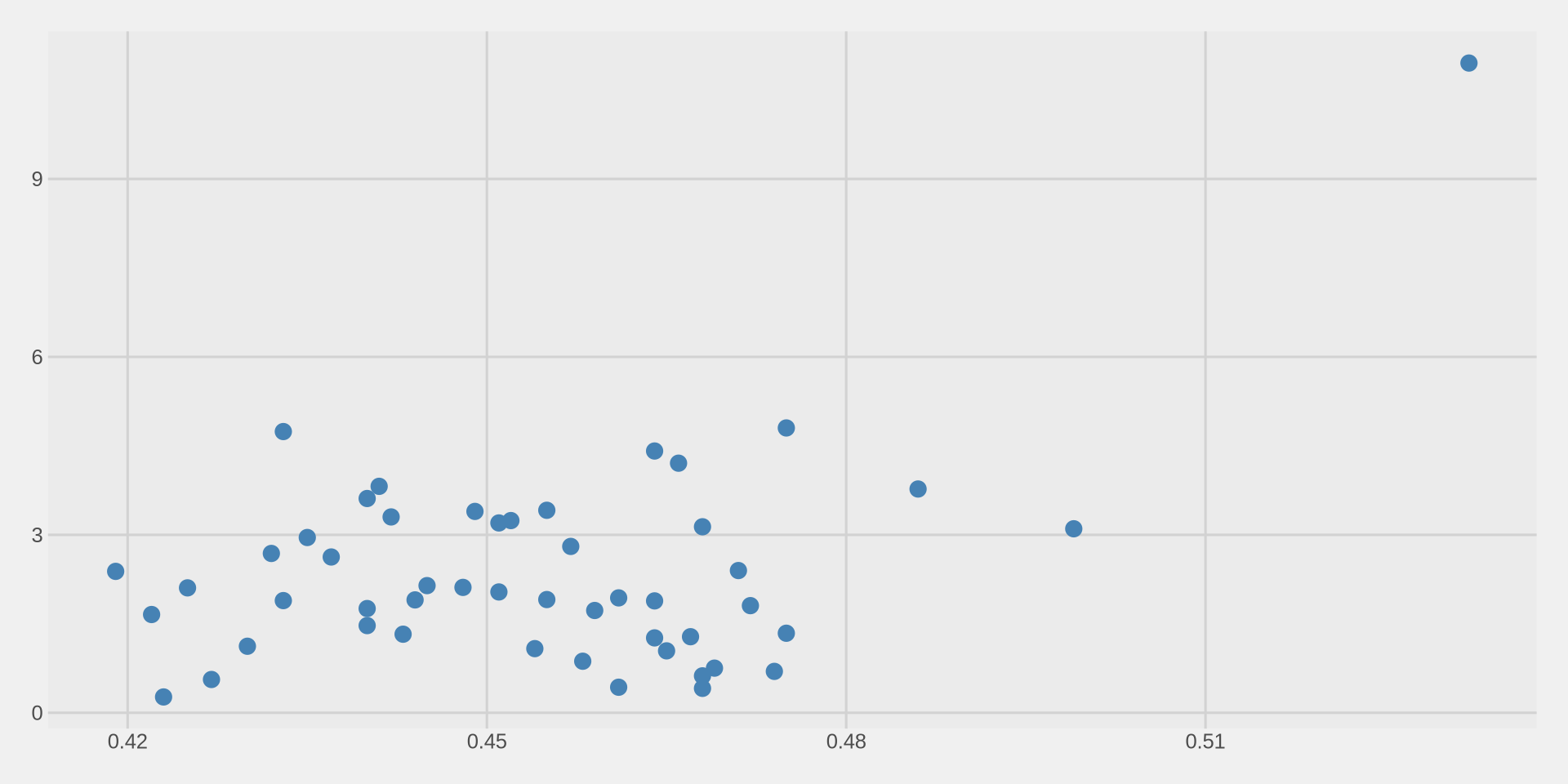
Step 1: Start with the data
Take our data set named hate_crimes,
I want to make a visualization, take my data set and apply ggplot.

Step 2: Set the axes
Now we need to tell R what goes on the x axis and what goes on the y axis.
For scatter plots we need both x and y inside aes().
x = gini_index(income inequality)y = hate_crimes_fbi(hate crimes per 100k)
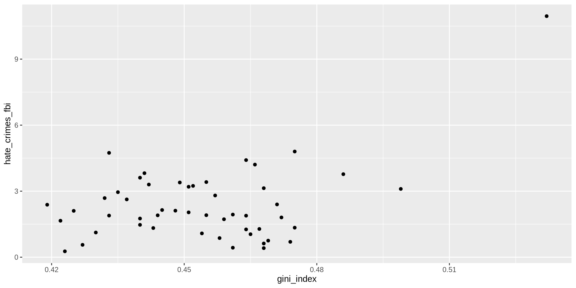
Step 3: Add the points
Remember, for histograms we used geom_histogram(), for density we used geom_density().
For scatter plots we use geom_point().
Each row in our data becomes one point on the plot.
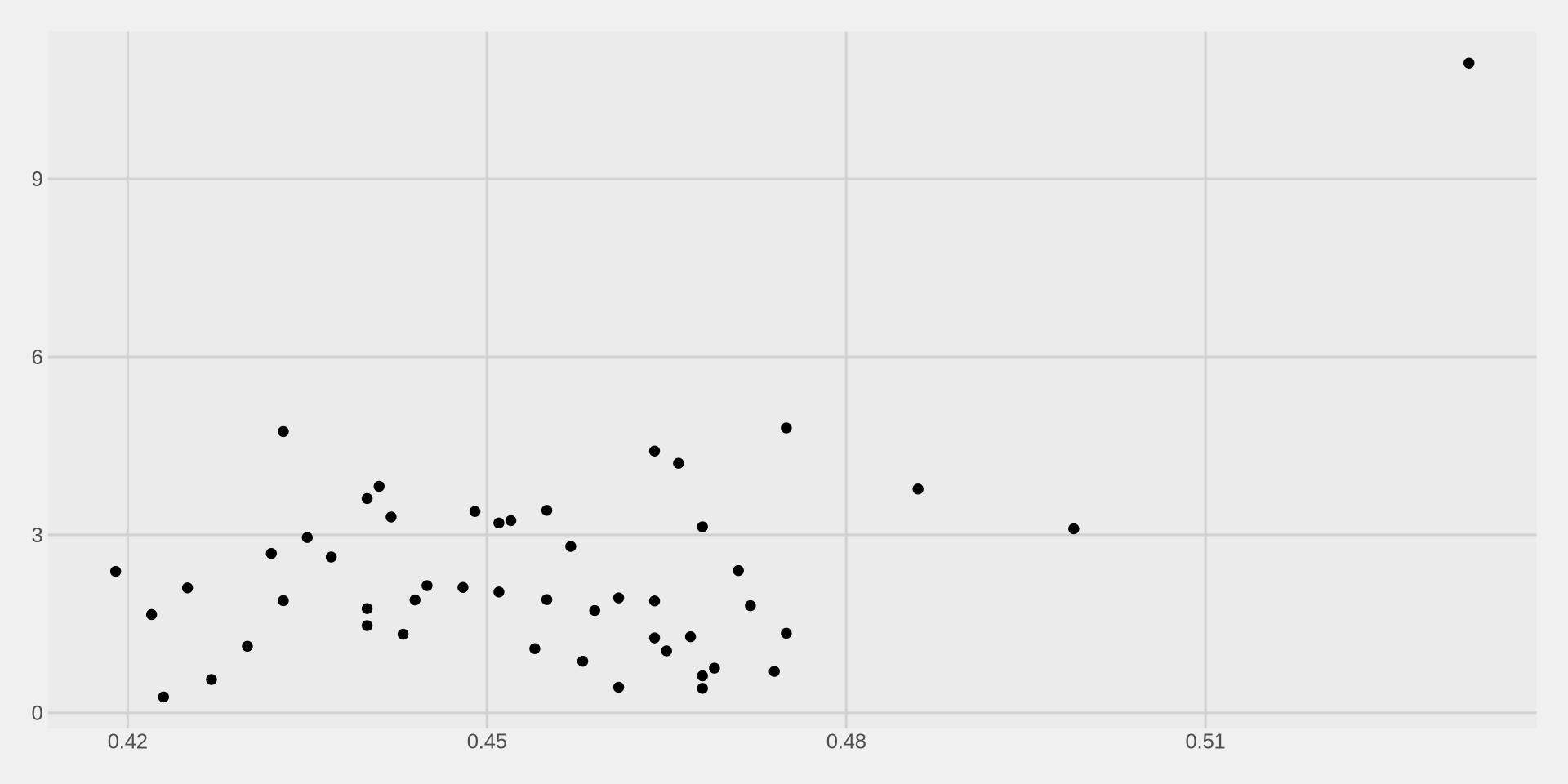
Step 4: Add a theme
Lets immediately clean it up with a theme.
Step 5: Customize the points
The default points are small and hard to see. We can change them inside geom_point():
size= how big the points are (default is about 1.5)color= the color of the points
Step 6: Fix the axes
Like in Week 3, lets increase the number of values on both axes.
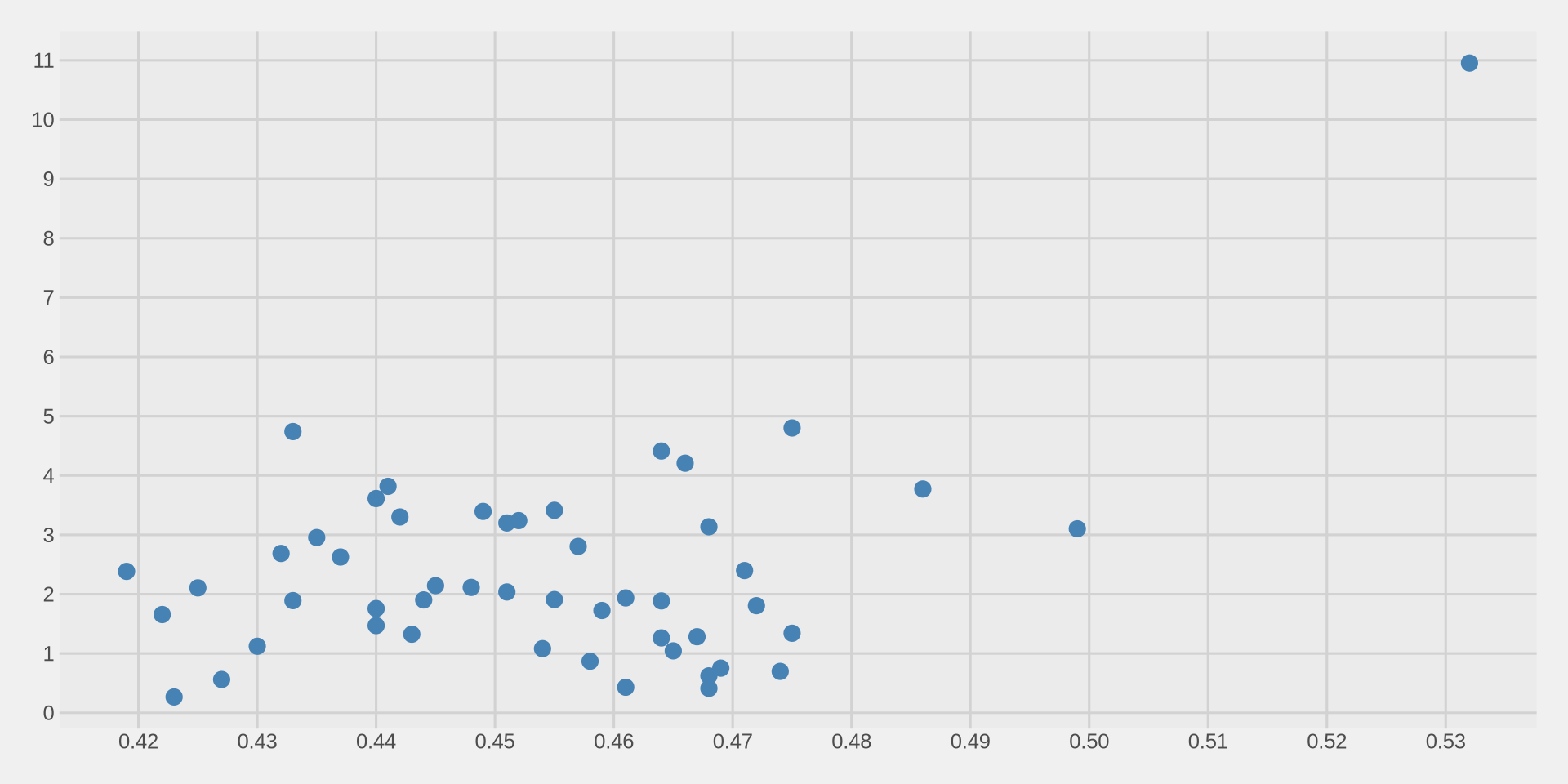
Add labels
Color by region
We move color from geom_point(color = "steelblue") to aes(color = region):
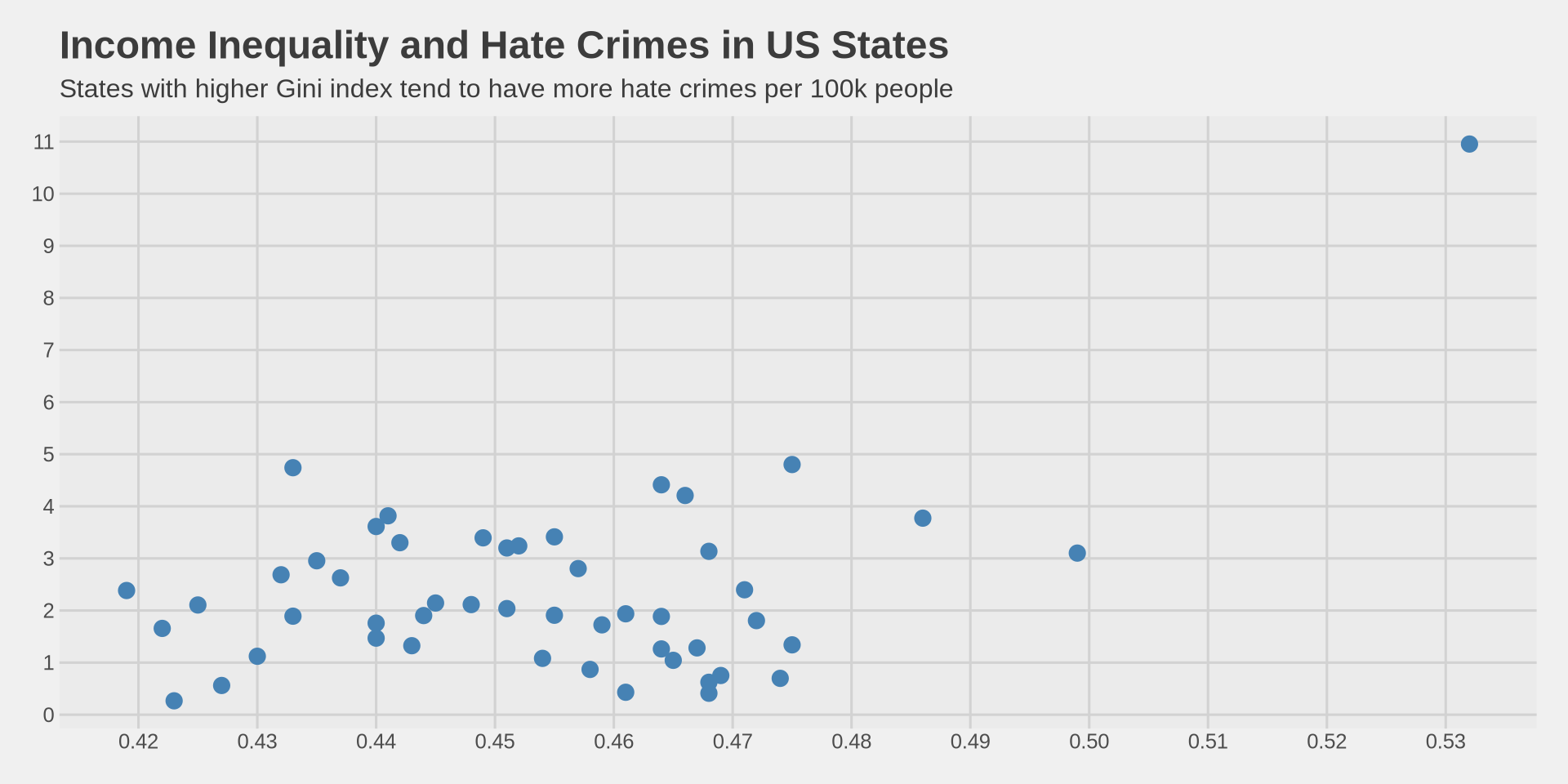
hate_crimes %>%
ggplot() +
aes(x = gini_index, y = hate_crimes_fbi, color = region) +
geom_point(size = 3) +
scale_x_continuous(n.breaks = 10) +
scale_y_continuous(n.breaks = 10) +
labs(
title = "Income Inequality and Hate Crimes in US States",
subtitle = "Colored by US Census region",
x = "Gini Index (Income Inequality)",
y = "Hate Crimes per 100,000 (FBI)"
) +
theme_fivethirtyeight()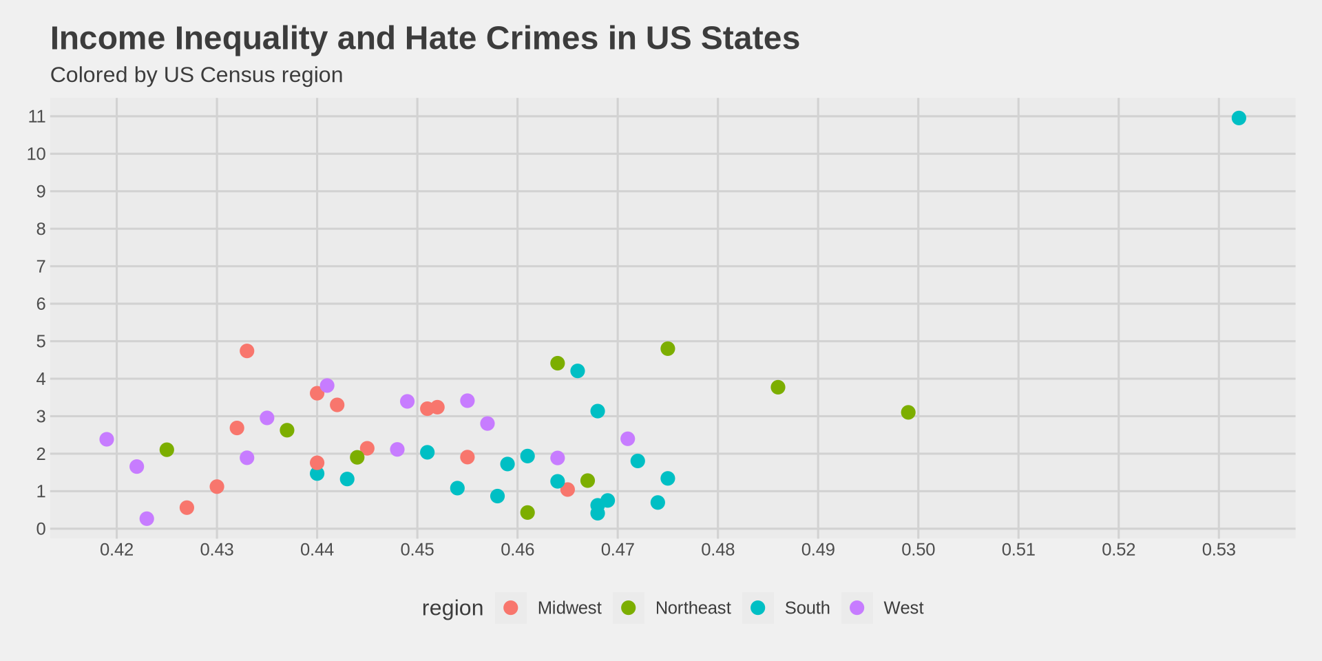
The alpha argument
Sometimes points overlap and we cannot see how many points are in the same area.
We can make points semi-transparent using
alphainsidegeom_point().alpha = 1means fully solid (default),alpha = 0means invisible.
hate_crimes %>%
  ggplot() +
  aes(x = gini_index, y = hate_crimes_fbi, color = region) +
  geom_point(size = 3, alpha = 0.7) +
  scale_x_continuous(n.breaks = 10) +
  scale_y_continuous(n.breaks = 10) +
  labs(
    title = "Income Inequality and Hate Crimes in US States",
    subtitle = "Colored by US Census region",
    x = "Gini Index (Income Inequality)",
    y = "Hate Crimes per 100,000 (FBI)"
  ) +
  theme_fivethirtyeight() +
  scale_color_fivethirtyeight()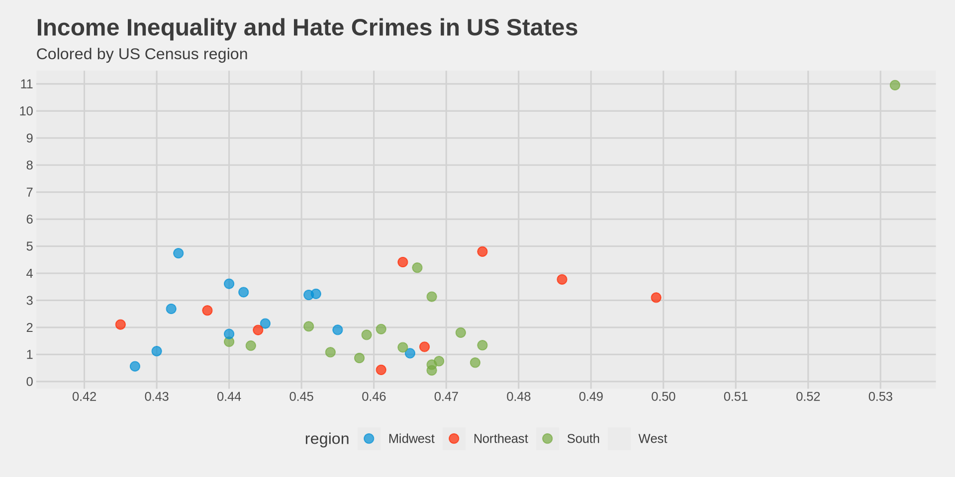
Adding a trend line with geom_smooth()
We use geom_smooth() to add a trend line on top of our scatter plot.
We add method = "lm" inside geom_smooth() to get a straight line. lm stands for linear model.
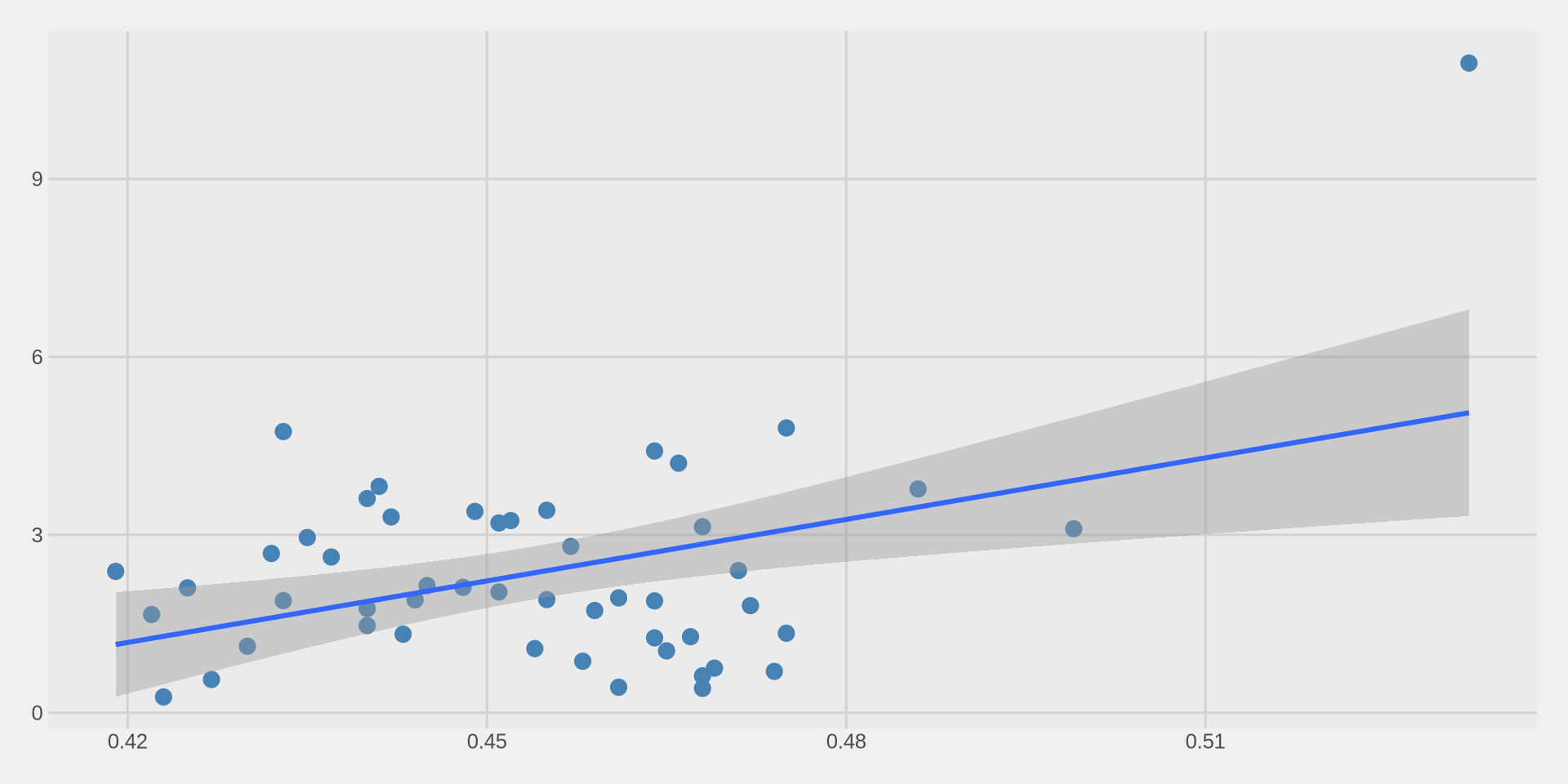
Understanding the trend line
The blue line shows the overall trend: as inequality increases, hate crimes tend to increase.
The gray shaded area around the line shows the confidence interval — it tells us how uncertain the trend is.
- A narrow band means we are more confident.
- A wide band means we are less confident.
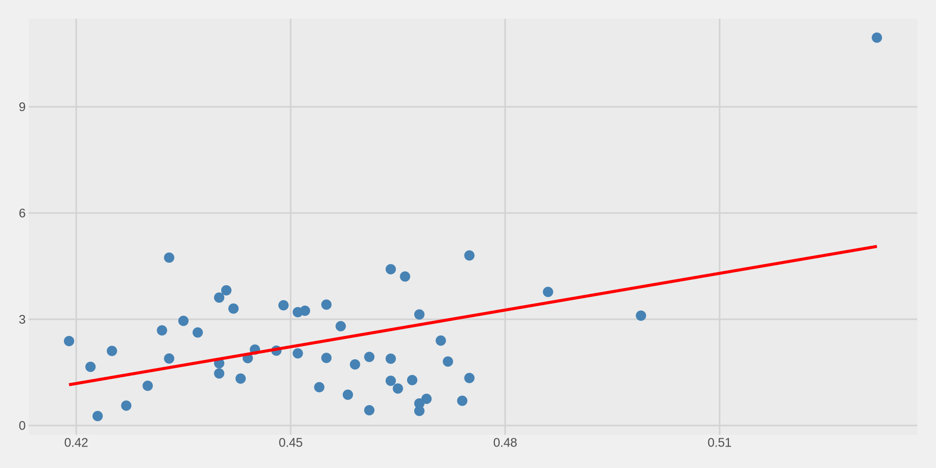
We can remove the confidence interval with
se = FALSE:
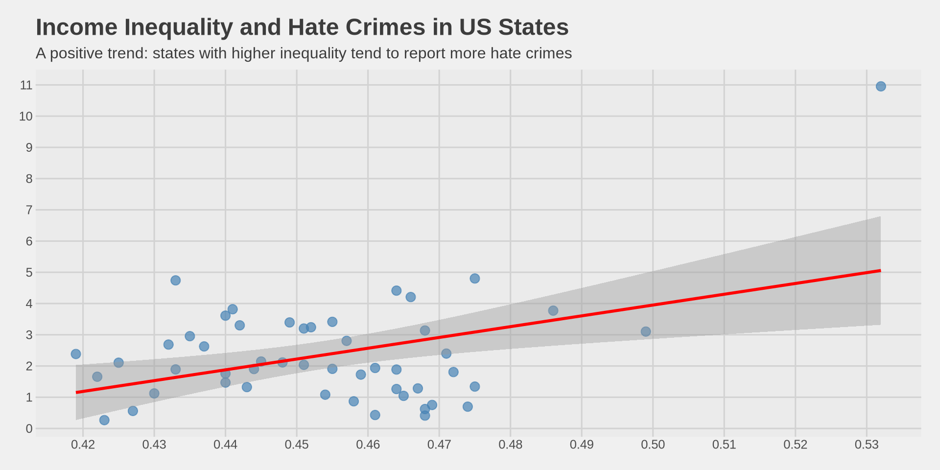
Putting it all together
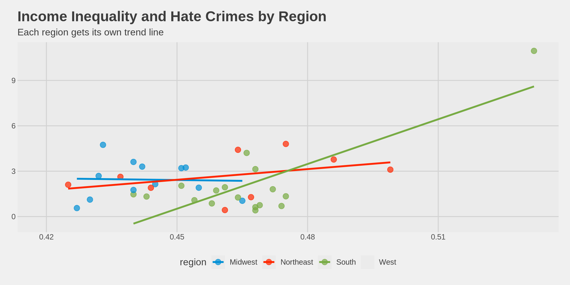
Trend line by group
What happens if we add color = region back into aes()?
hate_crimes %>%
  ggplot() +
  aes(x = gini_index, y = hate_crimes_fbi, color = region) +
  geom_point(size = 3, alpha = 0.7) +
  geom_smooth(method = "lm", se = FALSE) +
  labs(
    title = "Income Inequality and Hate Crimes by Region",
    subtitle = "Each region gets its own trend line",
    x = "Gini Index (Income Inequality)",
    y = "Hate Crimes per 100,000 (FBI)"
  ) +
  theme_fivethirtyeight() +
  scale_color_fivethirtyeight()